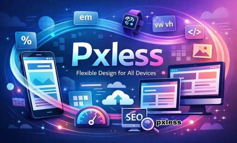
Pxless: Why Flexible Design Thinking Matters More Than Ever
The internet no longer belongs to a single screen size, a single device type, or a single way of browsing. People now access websites through smartphones, tablets, laptops, desktops, foldable screens, smart TVs, and even in-app browsers that display content differently from traditional web windows. In such a fast-changing environment, design systems built around fixed pixel measurements often struggle to keep up. This is where pxless becomes an important idea. Pxless is not simply a stylish buzzword or a passing design trend. It reflects a broader shift in digital thinking, one that moves away from rigid pixel dependency and toward flexible, scalable, and more adaptable digital experiences. Instead of forcing every interface element into fixed dimensions, pxless encourages designers and developers to build layouts that respond naturally to real devices and real users.
What makes pxless especially relevant today is that user expectations have changed. People want websites to feel effortless. They expect pages to look clean on any screen, text to remain readable, buttons to stay usable, and content to flow properly without awkward spacing or broken sections. They do not think in terms of design units, but they notice immediately when something feels too small, too cramped, too slow, or simply wrong for their device. Pxless thinking responds to that reality. It prioritizes responsiveness, usability, and adaptability instead of chasing a perfect fixed layout that only works under ideal conditions. In many ways, pxless represents the future of web design because it is built around how the web actually behaves rather than how designers once wished it would behave.
What Is Pxless and Why Is It Gaining Attention?
At its core, pxless is a design philosophy that reduces reliance on fixed pixel values and instead embraces more fluid design methods. That does not mean pixels disappear completely. Rather, it means designers stop treating pixels as the default answer for everything. When every heading, card, section, button, and spacing value is controlled by rigid pixel measurements, the design can become fragile. It may look polished in one mockup, but it often begins to break as soon as it meets real-world screen variety. Pxless aims to solve that issue by encouraging the use of scalable units, flexible layouts, and design relationships that adapt more gracefully.
This approach is gaining attention because the limitations of fixed-pixel design are becoming more obvious. A layout designed perfectly for one laptop might feel oversized on a tablet and cramped on a smaller phone. Typography that looks balanced on a high-resolution display might seem too tiny on another device. Even images can become a problem when websites serve assets based on fixed assumptions instead of real user context. Pxless addresses these issues by treating digital interfaces as living systems rather than static posters. It asks an important question: instead of designing for one ideal screen, why not design for changing conditions from the beginning? That question is exactly why pxless feels modern, practical, and increasingly necessary.
The Problem With Traditional Pixel-Based Thinking
For years, pixel-based design gave teams a sense of control. It allowed them to define exact values and create layouts that looked highly precise. In the early days of web design, when device diversity was much smaller, this approach often worked well enough. Designers could aim for a limited set of screen widths and trust that most visitors would see something close to the intended layout. But the digital world has changed dramatically. Today, the same website may be viewed on a tiny phone screen during a commute, on a widescreen monitor in an office, or on a tablet at home. A design that depends too heavily on fixed pixel values often cannot handle that kind of variation smoothly.
The weakness of traditional pixel-based thinking is that it assumes stability in a medium that is constantly changing. The web is not print. It is not a static canvas. It is an interactive environment shaped by browser settings, operating systems, zoom levels, user preferences, screen densities, and accessibility adjustments. When design systems ignore those factors, they create friction. Text may become harder to read, whitespace may collapse, interface elements may overlap, and users may need extra effort just to navigate simple content. Pxless matters because it accepts that digital design is not about locking things down forever. It is about building systems that remain strong even when conditions change.
How Pxless Supports Better User Experience
One of the biggest advantages of pxless is its direct impact on user experience. A flexible interface feels more natural because it adjusts to the user instead of forcing the user to adapt to it. When typography scales better, reading becomes easier. When spacing adjusts intelligently, pages feel calmer and more organized. When containers can stretch or shrink without breaking, content remains accessible across devices. This is the true strength of pxless: it improves the experience not through visual gimmicks, but through structural intelligence.
A pxless design philosophy also supports accessibility in meaningful ways. Many users increase font size, zoom in, or rely on system settings that change how websites are displayed. Fixed-pixel systems often resist these adjustments, making content harder to consume. Flexible systems, on the other hand, are more likely to respect user preferences because they are already designed to scale. That does not automatically make a website fully accessible, but it creates a stronger foundation. In practical terms, pxless encourages interfaces that are more readable, more forgiving, and better suited to diverse audiences. That is increasingly important in a digital environment where inclusivity is not optional but essential.
Pxless and the Shift Toward Responsive Design
The rise of responsive design made it clear that digital products cannot be built around one layout anymore. Pxless fits naturally into that evolution because both ideas share the same central goal: creating experiences that work across a wide range of devices and viewing conditions. Responsive design focuses on flexible grids, scalable media, and adaptable content flow. Pxless strengthens that mindset by pushing teams to think beyond exact numeric control and toward design relationships that remain consistent even when dimensions change.
This shift is important because modern digital products are expected to live longer and work harder than before. A website launched today may need to function across future devices that designers have not even considered yet. A rigid layout tied too closely to fixed pixels can age quickly, while a pxless approach is more future-friendly. It helps teams build systems that evolve more easily, require fewer constant design fixes, and stay visually strong as products grow. In that sense, pxless is not only about current usability. It is also about long-term resilience.
Why Pxless Can Help Performance and SEO
Another reason pxless is becoming more relevant is its connection to performance and broader site quality. Flexible, well-structured interfaces often encourage cleaner design systems. They reduce the need for endless overrides, awkward layout patches, and oversized visual elements that slow down pages. When a design system is built more intelligently, it tends to be easier to optimize. Faster loading times, better content structure, and improved mobile usability all contribute to a better experience for users.
This also matters from an SEO perspective. Search engines increasingly reward websites that perform well on mobile devices and provide smooth user experiences. While pxless alone is not a magic SEO tool, it supports the conditions that often lead to stronger search performance. A website that adapts well, loads efficiently, and keeps users engaged is more likely to perform better over time than one that feels broken or frustrating on smaller screens. Pxless therefore should not be seen as an SEO trick, but as a strong design foundation that aligns with what both users and search engines value: clarity, speed, and adaptability.
Does Pxless Mean Designers Should Stop Using Pixels Entirely?
This is one of the biggest misunderstandings around the term pxless. The answer is no. Pixels still have their place in digital design. Certain small visual details, borders, icon alignment needs, or highly controlled interface moments may still benefit from pixel values. Pxless is not a strict ban on pixels. It is a mindset shift that asks designers to stop depending on them for everything.
That distinction is important because it keeps the concept realistic. Good design is not about following extreme rules. It is about making smart decisions based on context. Pxless simply reminds teams that flexibility should come first in a medium that is inherently fluid. Instead of building every decision around exact pixel dimensions, designers can focus on proportion, scaling, rhythm, and responsiveness. In real projects, that usually leads to better results because the interface is designed to work with the web instead of against it.
How Businesses and Creators Benefit From Pxless Thinking
Pxless is not only useful for designers and developers. It also benefits businesses, content creators, and brands that depend on digital visibility. A more flexible website often reaches users more effectively because it removes friction from the browsing experience. Visitors stay longer when content is easy to read and navigate. Customers are more likely to complete actions when buttons remain usable and layouts remain stable. Content marketers benefit when articles look clean across devices. E-commerce brands benefit when product pages remain attractive and functional whether viewed on a phone or a desktop.
For growing businesses, pxless also supports scalability. A rigid design system becomes harder to manage as new pages, products, and campaigns are added. A more flexible system, however, gives teams room to expand without rebuilding the entire structure every time. That makes pxless valuable not just as a design idea, but as a strategic one. It helps organizations build digital products that can grow without losing quality.
The Future of Pxless in Web Design
As digital products continue to evolve, the principles behind pxless are likely to become even more important. The web is moving toward more adaptive experiences, smarter layout systems, and stronger user-centered design. Fixed measurements alone cannot carry that future. Designers need systems that work across uncertainty. Developers need methods that are easier to maintain. Users need experiences that feel natural regardless of where they are browsing. Pxless supports all three.
The growing interest in pxless shows that the industry is recognizing a deeper truth: great digital design is no longer about controlling every pixel. It is about creating interfaces that stay useful, readable, and elegant in real conditions. That is a more challenging goal, but it is also a more meaningful one. Pxless reflects that maturity. It is less about abandoning structure and more about building smarter structure.
Conclusion
Pxless represents a powerful shift in how modern digital experiences are imagined and built. In a world filled with different screens, unpredictable layouts, and constantly changing user behavior, fixed-pixel thinking feels increasingly limited. Pxless offers a more practical direction by focusing on flexibility, scalability, responsiveness, and long-term usability. It encourages designers and developers to create systems that adapt naturally instead of breaking under variation. More importantly, it reflects what the modern web truly needs: experiences that work well for real people in real situations. As digital design continues to grow beyond traditional boundaries, pxless is not just an interesting concept. It is a valuable way of thinking about the future.
(FAQs)
What does pxless mean in simple terms?
Pxless means designing digital experiences with less dependence on fixed pixel values and more focus on flexible, scalable layouts that work across different devices.
Is pxless a coding language or a design tool?
No, pxless is not a coding language or software tool. It is a design philosophy or mindset that influences how websites and interfaces are planned and built.
Does pxless replace responsive design?
No, pxless does not replace responsive design. It supports and strengthens it by encouraging designers to think more flexibly about layout, typography, and spacing.
Can pxless improve website performance?
Yes, pxless can support better performance by encouraging cleaner layouts, more adaptable media handling, and better user experiences across devices.
Should every website use pxless principles?
In most cases, yes. While pixels still have some uses, adopting pxless principles can help most websites become more future-ready, user-friendly, and easier to maintain.